5 common website mistakes costing your financial advice business (and how to fix them)
Would you proudly invite a new client to meet you in your office if it was messy, cluttered, and dusty?
Unlikely. Because first impressions matter.
The chances are that any client who has ever considered working with you has visited your website. As a financial advice business, your website is your digital office, the centre of your marketing world.
Just as a clean and welcoming office space can leave a lasting positive impression, a well-designed website serves as the digital front door to your financial planning business, inviting potential clients to learn more and engage with your services.
Your website is an opportunity to take intrigued onlookers from "maybe" to "yes please!"
Just like having a messy office, an outdated website could be turning people away and costing you business.
Unfortunately, too many financial planners take the “set and forget” approach to their websites.
Ask yourself, when was the last time you viewed your website through the eyes of a prospective client?
FREE DOWNLOAD
With this in mind, let’s look at 5 of the most common mistakes we see financial advice businesses make when it comes to their websites, and some tips on how you can fix them.5
Mistake #1
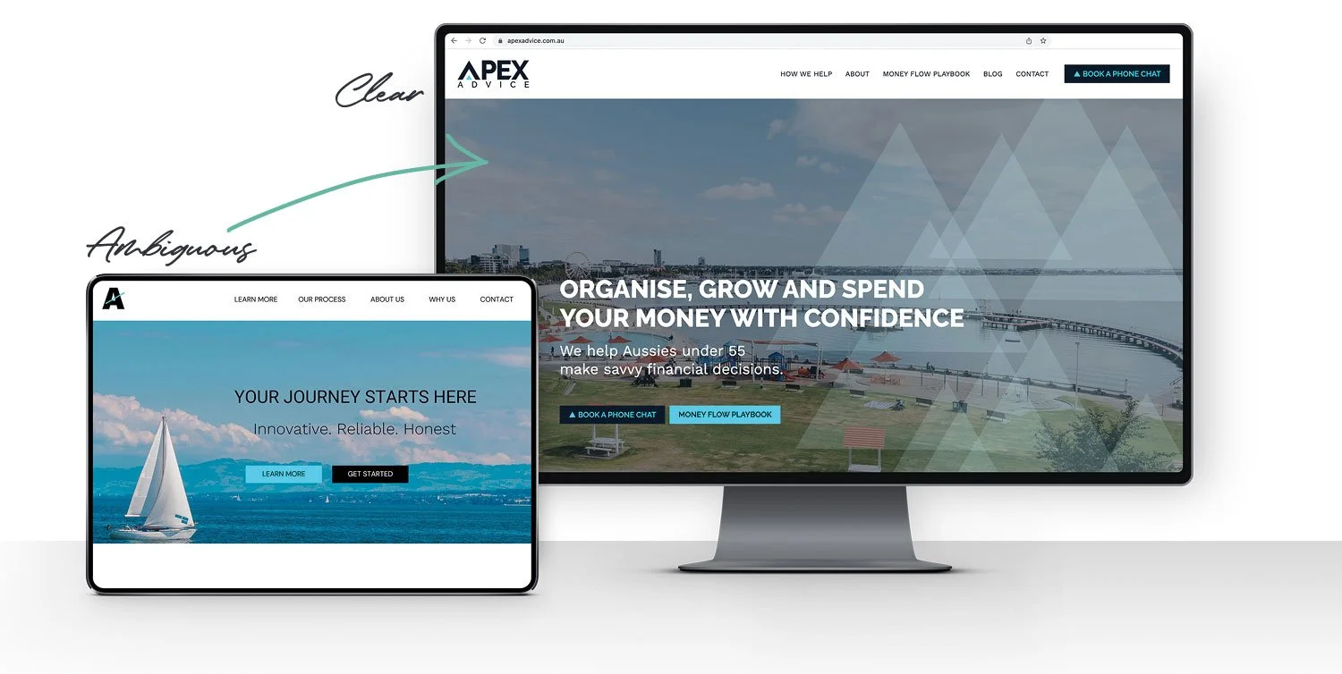
Your website header is confusing
The header is the first section of a website you see. It's also called the ‘hero section’.
People today are so busy, so bombarded with information. If we don't convince them quickly that we're worth their valuable time, money, and attention, they'll switch their focus somewhere else.
Research shows you have 3 to 5 seconds to capture someone’s attention and in that flash of time, they need to be able to answer these three questions about your business:
What do you do?
How does it make my life better?
How do I get started?
It's what we refer to in the marketing world as the 'grunt test'. If your header doesn’t pass the grunt test, your potential client will leave your website without learning any more about your business.
Fix #1
To pass the ‘grunt test’ your header must:
Include a clear and concise statement of what you do and who you help.
Describe how you can make the client's life better, and
Include a clear call to action.
Remember to be concise; you want the reader to quickly understand what you do, how it helps them, and what their next step is. Whitsunday Wealth perfectly demonstrates these 3 criteria as readers easily identify what service is provided, how they'd benefit, and how to book a chat.

TIP: Don't be clever or cute. Focus on being CLEAR. If people are scratching their heads after landing on your website, wondering what this has to do with them, they will likely zone out and get distracted by something else.
Mistake #2
There are no clear calls to action
A call to action is a direction you're giving to someone visiting your website, telling them what to do.
The most obvious direct call to action for a financial planner is "Schedule a call" or "Book a Zoom chat’. If you don't have an online scheduling tool, it might be "Contact us" with a link to an enquiry form or "Call us for a free introductory chat". (Although we highly recommend the scheduling option if you're not a fan of unexpected phone calls!)
Some common call to action mistakes to watch out for include:
Vagueness: Using generic phrases like "Learn more" or "Click here" without specifying what the visitor will learn or where they will be directed.
Hard to find: Placing calls to action at the bottom of long pages or in locations that aren't immediately visible to visitors.
Overwhelming choices: Offering too many calls to action on one page can lead to decision paralysis for the visitor.
Sometimes people might not be ready to take the step to engage with your business right away, so you need to give people a transitional call to action that helps them get to know you a little better and have time to 'warm up' to what you have to offer.
This is where a ‘lead magnet’ or ‘freebie’ comes into play.
A lead magnet is any free resource, like an e-book, webinar, template, or downloadable checklist, that helps people experience the results of implementing your expertise while building trust and establishing your credibility in their eyes.
People will usually enter their email address in exchange for receiving this lead magnet. You can then go on to nurture this lead (hence the term lead magnet) to continue serving them information of value that will continue the trust and credibility-building exercise.
Fix #2
Include one clear call to action on your site. This is the first step you want people to take to engage with your financial planning business.
Your direct call to action is like your cash register. You need to put it throughout your site, not just in the header.
Give people the opportunity to ‘warm up’ to your business by offering a practical lead magnet.
We've listed some effective example calls to action below.
Direct Engagement calls to action:
"Schedule your free financial health check"
"Book your 30 minute financial strategy session now"
Transitional Engagement calls to action:
"Download our free retirement planning guide"
"Join our newsletter for financial tips and updates"
Engagement-encouraging calls to action:
"Watch our client success stories"
"Read about how we've helped others achieve financial freedom"
Navigational calls to action:
"Explore our wealth management services"
"Learn more about our financial planning process"
TIP: Notice that each call to action uses a deliberate and unique verb that engages readers whilst still being succinct and action- and benefit-oriented.
Mistake #3
You’re making yourself the hero instead of the client
This is probably the most common problem we see on all financial advisor websites.
Practices tend to make their website all about them: their expertise, their professional training, their awards, their achievements.
In reality, the focus needs to be on your prospective client.
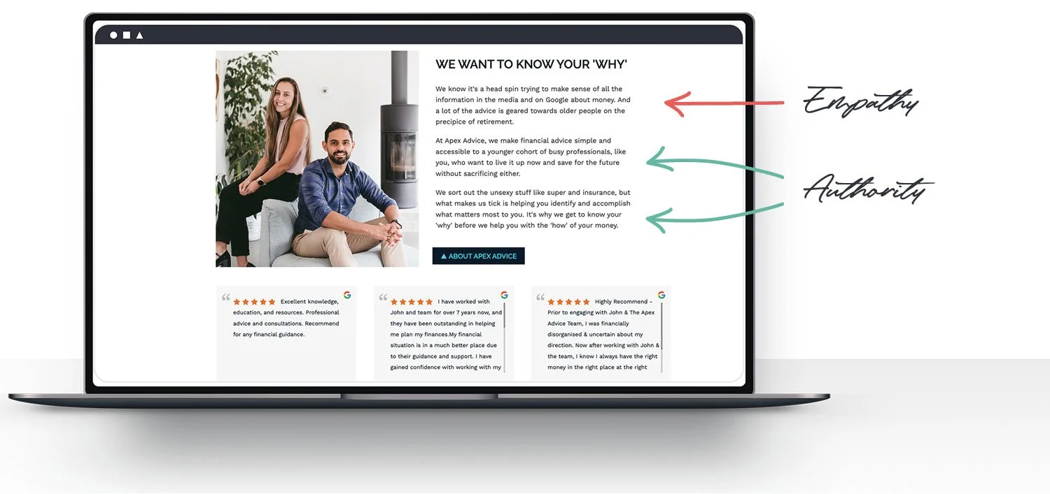
Fix #3
Make the client the hero, and establish yourself as the guide who understands their problems and the struggles they’re experiencing - become the authority to guide them towards a solution. This approach should carry through into your marketing as well.
To establish the client as the hero, you need to invite them into a story by showing them that you understand their problems and how those problems make them feel.
Display empathy by using words like, ‘we get it’, ‘we understand’, and ‘we know how hard it is’.
Establish your authority by adding client testimonials and client success stories that show how you solved particular problems for others, and what their life looks like now that they have worked with you.
Mention industry awards, accreditations and/or statistics to back up your claims. Make sure that these are merely supportive, and not the focus.
Mistake #4
You haven’t provided a plan
Often clients hoping to work with a financial planner are engaging your services for the first time. How the financial planning process works is a complete mystery to them; a mystery that often deepens when they visit an advisory website!
You need to be able to clear that fog if a website visitor is going to be interested in working with you.
This isn't about sharing your entire financial planning process. (That could potentially scare people away!) Instead, you want to provide a simple 3-step plan that's easy to memorise, just like “Slip, slop, slap”, “Stop, drop, and roll” or “Stop, look, and listen” that are ingrained in our minds!
Fix #4
Include a simple 3 step plan on your home page:
Step 1: Engagement – What’s the first step to get started?
Step 2: Experience – What’s the main thing that happens?
Step 3: Success – What does success look like?
Remember you can always go into more detail on your processes on another page of your site, or your blog. This is called progressive disclosure and allows readers to dive deeper and navigate to areas they're specifically interested in. For your homepage, however, keep it simple and let them know what’s in it for them. You don’t want to overwhelm visitors with too much information all at once.
Mistake #5
Your website is cluttered and confusing
People tend to scan websites. Someone would rarely read every word from top to bottom. (Pay attention to your own user habits on the next few websites you land on.)
A busy, messy, and cluttered website makes this scanning process difficult and confusing.
The ability to simplify means to eliminate the unnecessary so that the necessary may speak
Remember the principle that 'less is more'? This applies to your website as well - make sure the copy and visuals you include add value and aren't just there because they can be.
Fix #5
You can take a number of steps to declutter your website:
Make copy clear and concise: If it doesn’t speak to your ideal clients, get rid of it. Write in plain English, avoiding industry-specific terms without explanations. This should also reduce visitor overwhelm.
Have bold headings that tell a story on their own: If someone just reads the headings on your homepage, ensure they still get a good feel for what you do and why you do it.
Use icons, images, and open space: This will help break up your text and create a high impact for visitors. In particular, don't underestimate the value of white space as a way to reduce clutter and create an organised layout.
Utilise effective content hierarchy: Ensure that your most important content appears first and your calls to action stand out with contrasting colours and buttons. Ensure that you position the most important content first.
Optimise your navigation: Streamline your navigation with clear, concise menu items that are intuitive to prospective clients. You could also consider including a search function in your blog to facilitate visitors finding articles they're particularly interested in reading.
Highlight testimonials and success stories: Dedicate a section of your site for client testimonials that don't overwhelm the main content. Consider using carousels to present success stories compactly.
TIP: Wherever possible, use images of your team, office, local area, and clients to create a ‘real and relatable’ vibe. If using stock images, be careful about the images you choose, ensuring they resonate with your ideal clients, feel authentic, and aren’t cheesy.
By focusing on these areas, you can transform your website into an inviting, informative space that effectively guides visitors toward taking the desired action. This not only improves the user experience but also positions your financial planning business as trustworthy and client-focused.
Get your website working for your financial planning business
Your website is so much more than a “set and forget” online billboard. Your website is your unique opportunity to capture the attention of a prospective client, communicate the value you can bring to their life, and nurture their interest in your business.
Importantly, the better your website, the more likely your existing clients are to refer you to their friends and family as well. They'll feel more proud and won’t have to add "I promise their services are better than their website looks".
Make these simple improvements to your site today and let your website become the 24/7 salesperson that converts interested onlookers into motivated, perfect-fit clients.
Download our free website makeover toolkit (see what we did here - it's a valuable freebie targeted to our ideal client, you). ⤵️